These 4 Design Concepts will Make Your Billboard Unforgettable
We’ve all seen billboards. Whether it’s driving down the highway or cruising on a surface street. Some of the art sticks in your head, but some doesn’t. What makes billboard art successful? There are four principal ways to make your billboard design unforgettable:
Readability
- A good rule of thumb when designing billboards is ‘7 words or less’. The shorter the message the clearer it is and the faster the drivers can absorb it. People need to be able to read it at a glance. Simple fonts are always best.
Eye-catching
- Billboard ads should be bright and bold! Muted colors have no place in this medium. Additionally, they must have high contrast. Even if all the colors are bright, if they don’t contrast you’ve defeated the purpose.
- Digital billboards have a natural brightness and always changing, which draws the eye.
Use Contacts & Directionals Only when Necessary
In the age of search engines, phone numbers, addresses and even urls are a thing of the past. If your business name is prominent, a simple search will yield the rest. However, there can be exceptions. Businesses without a strong online presence or businesses that could be easily confused with competitor’s online could benefit from listing contact methods on their billboard.
- Directionals that are clear can be effective at drawing in impulsive consumers. However, long addresses on billboards are less effective because they are difficult to read quickly. A full mailing address including the state and zip code is never necessary. A street name could be recognized by a local customer, but often directions can be searched in google or apple maps much more effectively. Meadow can make directionals short and sweet.
- This McDonalds billboard outside The Dalles, Oregon for example, lists no contact method or directional, trusting instead that hungry customers will search and find the nearest restaurant online. Situational Humor
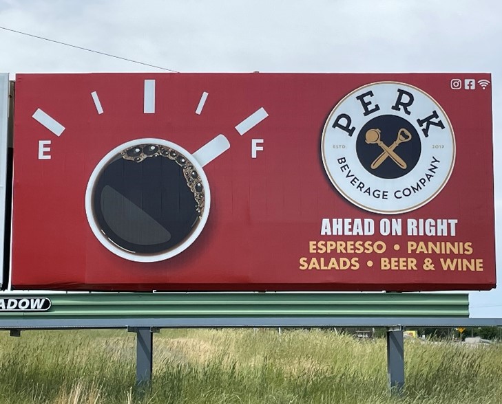
- When possible, humor in an image or tagline can go a long way to earning favor with viewers. Billboards are made for visual humor; this art Meadow created for Perk Café is a great example of connecting with viewers through a visual riddle that makes them smile when they solve it.
For more information on billboard art check out the creative services tab on our website!
If you are interested in advertising on one of our billboards call us at 800-221-4114 or email us at meadow@meadowoutdoor.com!